
SUBSTANCE DESIGNER WIZARDY - SCI-FI PANELLING
Lead Environment Artist at Creative Assembly, Simon Pennington, walks us through how he created this material from the ground up. In this extensive breakdown, you will learn how he planned the material, created the basic shapes as well as some neat tricks for your albedo and roughness maps. If you are interested in Substance Designer, do not miss out on this one!

Introduction
Hello, my name is Simon Pennington. I come from Tasmania in Australia. I have been in the industry since 2003. I started dabbling in Half Life, making maps and then moving onto mods.Character art eventually caught my eye and I got a job at Creative Assembly (Australia) as a Character Artist. This was quite fun but my heart belonged to the creation of worlds! I migrated back to Environment Art.
I did some freelance work on Bioshock: Infinite and eventually found myself moving to Canada and working on Halo 4 DLC and Warframe at Digital Extremes.
From there I moved back to Creative Assembly (UK) and am now the Lead Environment Artist on Total War: Warhammer.
Some of my personal work that you might recognise can be found on my youtube page, the most popular being a Viking Village.
Inspiration
I wanted to create something that was simple but complex in it's detail. In this case the idea was something similar to the 80s/90s kit model style ships you see in Star Wars, Red Dwarf and the Homeworld series.
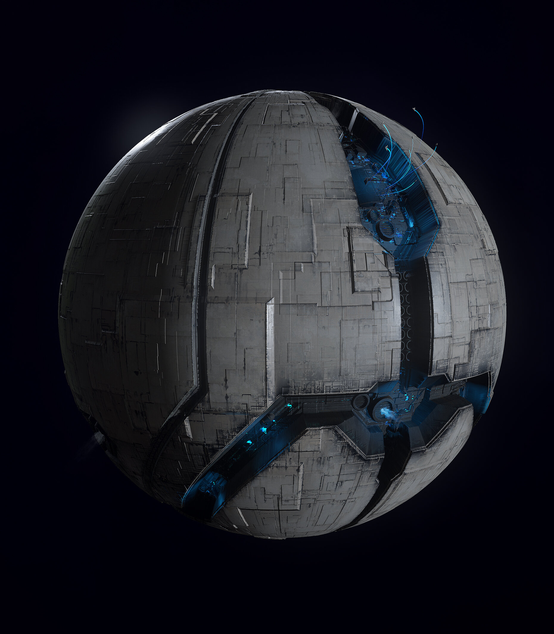
I decided to make a space station with a small docking area. Surrounded by ventilation (for when it entered atmospheres). The main part of this would be a feature in the form of a valley on the surface of a space station - in which you can see the lights, details on the underlying structure of the station. Beaming out light into space. But before that, I needed to do a bit of research.
Planning:
My first step was to break down the references I gathered and find similarities.

Star Wars

Homeworld
The two examples above are very similar in the fact they are both simple shapes with detail in certain areas to give weight to the rest of the ship. This would be the main theme I aim to reproduce.
The next step was to decide on the shape of the surface features. I tried many different shapes, but ended up settling on the simplest, as this was truer to the references.
Shape Examples

Shape Examples
I went with a pattern similar to the center example as it opened more areas for me to put detail in without overwhelming the surface.
Now that I had my feature shape decided it was time to set some guidelines for myself. I did this to prevent myself from going too deep into detail, opting instead for the impression of detail.
Then I take a closer look at each of the three areas of the references, breaking each surface down further to help tell a story:
Station Surface:
Multiple layers of paneling
Surface colouring
Recess
Recess:
Shape of recess
Machinery, ports, vents
Lights
Lights:
Location and brightness.
With these guidelines in mind I went on to start setting up the shapes I would be using.
Shape Construction
Starting by placing the feature Recess - thus defining the first and second reads. Using this shape to create volume and then shaping the volume with a curve node:

I use the height extrude node to get a quick look at how some of these volumes read. Now that this is locked down I can start looking at the rest of the shapes.
Shapes
Here are some of the shapes I used to add detail and story into the recess. Simple Shapes:

Shape Library

Combined Shapes

Feature Shapes (with height extrude to test the volumes)
Detail Distribution
The surface of the station is covered in many volumes. To try and get the feeling of the references - I added each layer one by one to see how far it could be pushed before becoming too noisy. Here is how that was achieved:


These volumes are used to generate the majority of the surface detail in the colour map. When applied to the surface of the material with soft light at 15% you get a very subtle layered look that gives the illusion of detail similar to the reference.
Below are the layers added in sequence:


The shapes placed in the recess are there to tell a story. Pipes, Engines, Vents, Fuel Tanks, Buildings and Docking ports. All these come together to give weight and scale to the area. When combined with the indented lights and the surface detail shapes it gives the illusion of detail that helps people come up with their own idea of what's happening there.
Colour Map
Before moving onto the colouring of this material I am going to deviate a bit here and go into more detail on some things. I have found it very useful to help define surfaces.
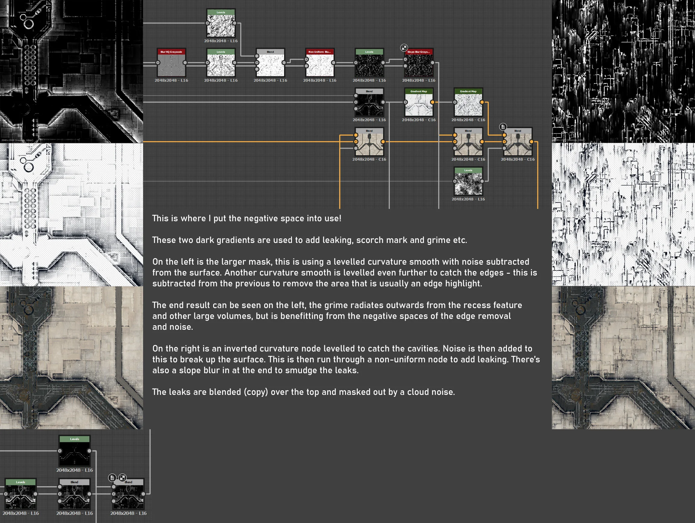
Negative spaces! By 'Negative Spaces' - I am referring to the sort of surface read that comes from the lack of detail - Instead of layering up lots and lots of detail you can achieve a nice result by excluding some areas from having detail.
Here are some examples:

Dirty Surfaces
The example above shows two sorts of wear, one is from a human's arm rubbing away at the leather and keeping it nicely polished - whilst the area around it is still covered in grunge. The other form is water droplets washing away the surface dirt, leaving a gradient of cleaner paint - effectively masking the dirt in. A lot of details can come from this.

Trees
Trees are a great example. A common trap people fall into with trees is spamming branches and leaves until the tree has no gaps for the light to shine through. But it's usually the gaps between these (negative space) that give the trees the volume and distribution that helps believability.

Substance Example 1
A plaster base with a noisey / natural mask for moss. Deeper levels of the plasters height map are excluded to break up the moss. Combined with a gradient and moisture noise to add chaos and story to it: The moss is climbing up the plaster whilst pieces of the surface have fallen away exposing the layers of plaster beneath.

Substance Example 2
The stone pillar around the door has a very simple colour gradient - there's no edge highlighting, no darkening into cavities - just flat noise. Then comes the mask, which is a leveled curvature smooth with subtractions from a procedural leak generated from the ao map and another curvature smooth leveled even more to subtract from the edges of the pillar. This helps define the surfaces story by adding age and wear. As in the example of the car door - people brushing up against the edges and water dripping down have helped wear the grime away, leaving the underlying pillar colour exposed.
I hope this idea helps!
Now onto the colour map.
Firstly I had a look at the references and decided the most common and safest scheme to follow was that of the Star Destroyer - Off white and black.
To generate colours I use two different gradient sources with a very simple but effective noise:

Moisture noise and MultidirectionWarp (by Chris Hodgson) at 0.1 strength. Gives a chaotic source of noise. This is usually blended with soft light and is used many more times for masking in the examples ahead.
Gradient Generation


Combining the Gradients

Once these gradients are set up they are used again to colour the Recess and add rust to it:

These two gradients are blended in with a mask generated from the original shape.
Now these two surfaces are defined I begin to add some surface noise. As you can see on this example from Red Dwarf's ship model:

Red Dwarf Ship Model
The surfaces are fairly simple with a red surface, black recess and some dark grime over it. Below is how I approached my own version of this:
The last part of this material is the lights.

Gradient Progression

That's it for the colour map.
The roughness is the next step and that is quite simple. It's using the same result that is used to generate the colour gradients. Leveled quite strongly.

Combined with masks from the other colour map masks subtracting to keep all reflections away from the grimes areas and lights.

The last step was to use the roughness to bring out some of the details that were muted in the gradient. I got the surface heights from the early stage of the shape creation and got a curvature from this, tiled it x2 then Levelling this and adding noise gave me a map that I lightly multiplied over the top of the station surface - having this extra source of detail gives even more scale to the material:

This can be seen on glancing angles.

Roughness Variation
I learnt a lot in the construction of this material and hope this break down helps!
Presentation
I wanted to get a similar feeling as the one in the 1980s Transformers movie - where Unicron devours other planets

Unicron
Whilst my end result was not a planet eating monster - The idea would be something giant and metal in space, emitting light into the dark void.
Scale
To give a sense of scale I used small ships exiting the station in a small formation, these were simple models with the same material as the station applied and long emissive homeworld style trails.

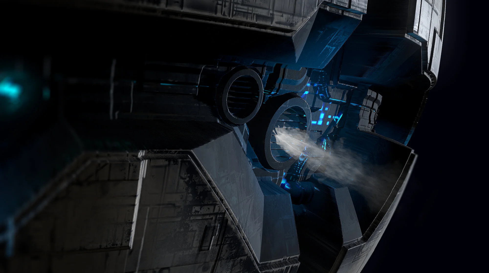
To add a bit more life into it I also used small plumes of steam coming some of the vents.

The shapes I chose were ones I experimented with in substance, cylinder, torus and sphere:
I liked them all for different reasons and so gave each of them some screen time.
Lighting
I added lights to subtly light up the areas of interest on the denser areas of emissive, along with a spot light to help focus the main area.

Lighting
All the shapes had backface culling off so that I got a bit more shadow info.
Cameras
The cameras all used the same post processing info and tone mapping to remain consistent. I used Hejl tone mapping and a bit of flare to bloom.
Conclusion
This project taught me a lot about simplicity, a lot of my previous substances have relied on a lot of details. Whilst creating that detail taught me a lot - it was a lot of effort that didn't push the pieces much further. 'Less is more' was my mindset on this journey and it was great fun.
If I were to give any advice when creating a substance, it would be that planning and simplicity are great friends to have!
Gather your references, step back and absorb them, don't go too deep.
Keep your shapes and masks as simple as possible with a clear goal in mind.
That's all from me. Thanks for reading and feel free to say Hi and follow me on Artstation.
Cheers!