
Environment Artist Fundamentals
Kem Yaralioglu talked about the way he approaches his surreal materials made in Substance Designer, terrain and world creation, working from concepts, lighting, and more.
Project-C
Project-C
Introduction
Hey everyone! My name is Kem Yaralioglu and I am from London, United Kingdom. I’ve lived and worked in three different countries: Germany, Russia and France. While in Russia I worked on Rainbow Six Siege. Currently I live in France working as a 3D Environment Artist at Darewise Entertainment where we are developing Project-C. Project-C is a persistent open world online multiplayer game which is in Pre-Alpha so go check it out!
As for how I got into the world of 3D art and games, I owe most of that to my older brother, Hus Yaralioglu who currently works in film. Growing up I tended to follow in his footsteps and he exposed me to the possibility of a creative career. I studied Games Art & Design at Norwich University of The Arts where I took a strong interest in 3D and started specializing. I knew early on in my studies that 3D was my passion and what I wanted to pursue.
Portfolio, Distilled Reality and Surreal Materials

Project-C
I spend a lot of my time focussing on colours and lighting, which for me is what makes or breaks a piece. The style I go for is a hybrid we at Darewise call Distilled Reality. We don’t call it stylized because that leans more towards bending or stretching shapes, instead, we are keeping realistic proportions but simplifying the non-important details. Distilled Reality was never something I intended or planned, it simply happened naturally during my time at Darewise. I’ve since embraced it in my personal work and I really think I’ve found my stride. Before Darewise I never really understood how important lighting or colour were and almost everything I’ve learned on that subject is from my Art Director, Viktor Antonov and Lead Artist, Bradley Jeannsone.

Substance Designer Materials
As you can tell from my portfolio, I have a strong passion for materials. Substance Designer is my favourite software and I love the challenge of re-creating a material in a procedural manner. If it’s something niche, difficult to comprehend or in general just looks unusual then that’s even better. The surreal material aspect of my portfolio actually started because of David Bowman. Every single day at work he would give me a new nugget of information or show me something weird on google, in time he started sending anything my way that he thought could be turned into a material which in turn resulted in the creation of my first real surreal material; the Strangler Fig. I’ve never met someone who has so much knowledge about the world and things that your average person is unaware of.

Strangler Fig Scene rendered in Marmoset Toolbag
The thing is, all of the common materials have been made 100 times over now. Everyone has made bricks and tiles, and if you haven’t then you can find 100 tutorials on this. I find surreal materials such as microscopic cells, macro photography or anything magnified far more interesting and challenging to work on. There are tons of resources available online such as ‘Nikon’s Small World’. I was just fortunate to have someone in the office who was always willing to share interesting things with me.
Working from Concept
When it comes to building an environment, be it a personal project or related to work, you always need a plan before going into production mode. There are three important pillars when it comes to creating an environment based on concept.
Gathering and using references, without them you really are working blind.
Breaking down the concept into tasks that you can actually achieve in a day to day basis. There are many tools available for this such as JIRA & Trello.
Regular feedback from your lead or a peer. I can’t stress enough how important feedback is. It’s so crucial to get another pair of eyes on your work but not too many because you can’t please everyone. Pick 2-3 people and ask them for regular feedback. No good comes from working in isolation and asking for feedback when you’re almost finished. Ask for feedback daily or weekly. We have daily feedback sessions at Darewise purely for this reason.
My most recent project was the Artstation Challenge – Legend of King Arthur. I chose this incredible concept by Jeremy Paillotin. You can view my submission here.
In the early stages of any project I always refer back to the concept. I’m not looking to recreate it 1:1, what I want to do is capture the same idea, emotion and story that the artist is showcasing

Concept Art by Jeremy Paillotin
Working from concept can be tricky because many artists, primarily juniors, tend to get stuck to the concept of having it in their mind that they should recreate everything and only things in the concept. In personal work that isn’t the case. As a creative we are able to inject our own thoughts, ideas and imagination into our work provided it does not contradict the source material. In production it can be different, depending on the studio. Some require that you work to the concept and not deviate from it, others provide more breathing room and creative freedom. I’m not a huge fan of the first approach as it handcuffs your creative mind. At Darewise our concept art pushes the visual style, story and setting, not where every single asset should be placed. This frees up my mind and lets me be creative. The concept is there to guide you and give you the foundation of the scene, not the end result. As with any project, everything starts with collecting references, we all know this step but it doesn’t hurt to mention it again.

Reference Board for my challenge
In Jeremy’s concept the sword is heavily emphasized and is the focal point of the scene . The sword looks important, powerful and everything is drawing you towards it. Simply put, the rest of the scene doesn’t matter, what matters is the sword. When you learn to break concepts down like this, you are able to enrich the work in 3D. I’ve been told my version looks similar to Zelda: Breath of The Wild, initially that wasn’t my intention, but as time went on I decided to take advantage and embrace it. I’ve kept the core premises of the concept, but with the addition of fireflies, butterflies, tree stumps, cool tones and a somewhat stylized approach, I have enriched the concept and made it my own in 3D.

3D Environment based on Jermey’s artwork
Recreating a concept in 3D will always be challenging because you have to consider the scene from every angle, where as a matte painter is typically building the piece from one camera shot. Matte painters can also work extremely quickly and are only limited by their imagination. Unreal Engine 4 is powerful but there are limits on what can be achieved, limitations such as tools available and performance. You need to be considerate of shader complexity, texture samples, memory budget and overall performance of the scene. There are many ways to optimize, a simple one is to pack your texture sheets. I always pack my texture sheets in a format called ARM (Ambient Occlusion in Red, Roughness in Green and Metal/Mask in Blue).

Example of how packed textures can be used. (This one is ARM)
Working from concept is a great exercise and personally, I prefer having a concept that drives the direction rather than drive the details. At Darewise we use concept art to push the high level direction more than using them to create specific areas, as an Environment Artist I have the creative freedom and imagination to put together an area of the world in a way that feels as though it belongs.
Project-C - Concept Art by Bradley Jeannsonne

Project-C
Landscapes and Terrain Creation
Creating large open worlds is always a hot topic because everyone wants to build one and fortunately that’s what I’m doing at Darewise! Houdini has been our main package for terrain creation and populating the world. I’ve also been testing a variety of different packages including Instant Terra, World Creator and more recently Gaea which I love.
When it comes to landscapes, the natural formation comes down to your erosion. You don’t want to push this too far or else it feels unnatural, but you want to have some to ensure everything is ‘blended’ together, much like a cake. Generating landscapes with Houdini is definitely viable and there are a lot of options available, options that can be exposed as parameters and used in-engine. With Houdini, being able to mask by slope or height and then scatter assets in those areas is extremely powerful and speeds up iteration time. The short video below demonstrates how you can scatter simple placeholder assets on your terrain based on masks. With a bit more love and care, this could be used to populate a forest.
Our current goal at Darewise is to create a library of ‘brushes’ that can be projected onto our terrain in editor. Think of these as individual terrain elements such as dunes, craters, hills etc which can be changed at any point in production. We’re building a non-destructive terrain tool that can procedurally generate our world and allow both artists and designers to make changes at any point in production. I’ve used a variety of different terrain packages and Gaea is without a doubt the most user friendly. It’s extremely easy to use, very quick and has a ton of nodes that other packages simply can’t compete with. For example, Gaea has 17 different erosion types while Houdini has 4 and Instant Terra has 2.
I made a short video to demonstrate how Gaea works. I chose a variety of different nodes for demonstration purposes.
Gaea also has a mutate option which allows you to update the random seed on all nodes in the graph or ones you select. I’ve made a video to demonstrate.
I want to create some tutorials for Houdini/Gaea to UE4 because I feel that a lot of people are hungry to learn these pipelines, especially industry standard pipelines for games. The logic behind all of the packages are the same, it’s simply how you use them. My advice to anyone looking to learn landscape creation is to start experimenting with Houdini or Gaea. You can create some beautiful looking landscapes in a matter of minutes with Gaea, and Houdini gives you the power of procedural generation.
Stylized Materials
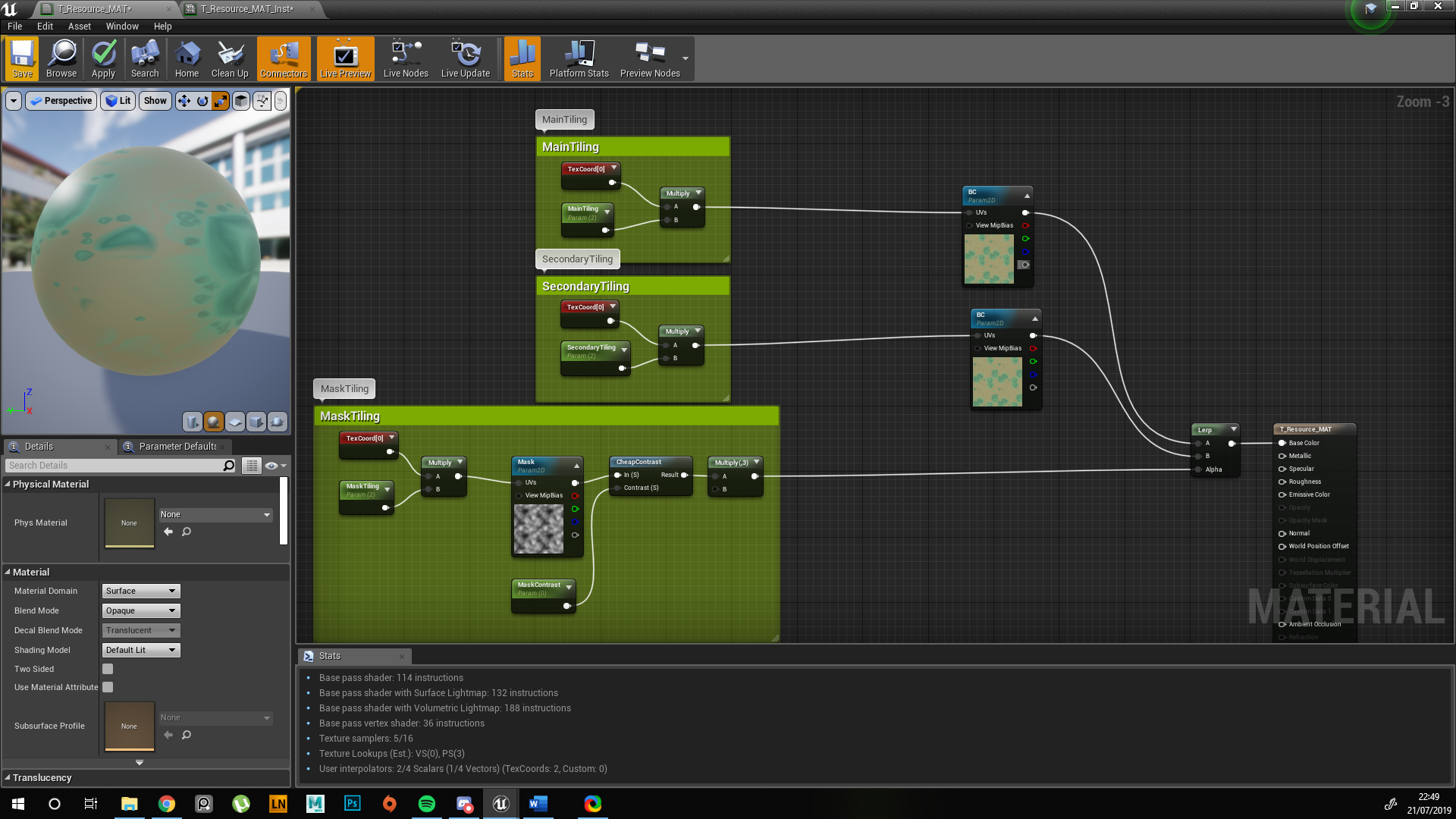
When it comes to creating stylized materials the key is to minimize the details. For Project-C, our visual design is built around three simple pillars. Strong silhouettes, reduced surface detail and simple colours (including gradients). For every material I always try to figure out the story behind it, why it exists, how it works etc. These are important questions that will help you build the material. I’ve included a breakdown of one of the materials used in Project-C; the Resource Material (due to NDA, we will not disclose the true name).

Project-C - Resource Material
Unlike your traditional materials, this one had a lot of needs from design, hence the concept. We needed variations in visual strength that would help convey information to players on how fertile the soil is. This helped in breaking down the concept into pieces and brainstorming which elements could be used to visualize the ‘fertility’. In the end I used a combination of the blue fluid, resource and pebbles.

Project-C - Concept for Resource Material
Building the Elements
I start with the ground, I knew we would want something soft, be it muddy soil or some sort of sand and the Non-Uniform Blur node works wonders for this. The goal is to minimize the details so what I’m really looking for at this point is a solid foundation for the ground that has height variation and looks fairly soft to walk on.

Resource Material - Ground
Glowing Lines
For the glowing lines I use a Tile Sampler and Distance node to generate a Voronoi pattern that I then edge detect. Then a combination of nodes along with a Non-Directional Warp with my ground to break up for shape. Following this I use a Non-Uniform Blur to create a soft mask that is then multiplied on top. The mask gives me variation in the values. I then use a Multi-Directional Warp to distort and create the ‘waves’ that are present in the concept.

Resource Material - Glowing Lines
Resource & Pebbles
The Resources are built in a separate graph for organizational purposes. I use the flood fill node to carve the sharp edges and then a blur to soften it up.

Graph for Resource
As I mentioned earlier about working from concept, it’s important to not get stuck with recreating what you see. There are actually no small pebbles in the concept but there are rules and laws of nature that apply to everything we create, so I add them to make the material feel natural.
The pebbles are a combination of using the Tile Sampler node along with mask inputs. The large resources are scattered and scaled based on the AO created from the ground. This is then blended with the ground with Height Blend. I use the height blend node because it outputs the height as well as a mask which is extremely powerful when it comes to creating your albedo. You change the height blend and the mask updates.

Resource Material - Height Blend GIF
The small pebbles require a bit more work. I create another AO based on the new height map and subtract the glowing lines and resources from this (we don’t want pebbles here). I use a dilation to expand the mask of the resource as a precaution before subtracting. I then add the dilation blend I created to force the base of the resources to be fully white so that the small pebbles will scatter there first.

Resource Resource Material - Resource & Pebbles

Resource Material - Mask for Pebbles
Colour for Stylized Materials
Throughout the entire graph I have only used two or three different noises. When it comes to stylized materials the secret is to avoid adding detail. The shape and colours will do the heavy lifting for you.
I have two main approaches when it comes to colourization. Using a gradient map and colour picking, or choosing 3-4 colours and blending those with masks. I usually pick a dark value, two mid values and a highlight. I prefer the latter approach as I can easily control and select new colours when I expose them as parameters. I set the colour nodes to 8x8, (these can be 1x1) for optimization purposes.

Resource Material - Base Colour
Parameters and Customization
When I feel comfortable with the result I have I will start exposing parameters. I try and avoid exposing too many parameters or else it becomes messy. You want to give yourself or another artist the bare essentials that will allow them to generate numerous variations.
The nice thing with this material is that everything is linked. If I add more resources then the pebbles will update and populate around the new resource, the glowing lines will be removed where the resources are and so on. When imported to UE4 with the Substance Plugin it allows for rapid iteration without leaving the engine. Take a look at this video if you want to learn more.
It takes seconds to change the material. This is important because when I’m showing my art lead what I have, it’s far more beneficial for me to be able to make rapid changes in-engine instead of going back to substance, make the requested changes, export the bitmaps and then re-import. Art leads are always busy so if there is a small adjustment he would like to see done, I can save us both time with this approach.
Tiling Tips
Just a quick tip on tiling materials inside Unreal Engine 4, or any other game engine for that matter. To help break up the tiling repetition you can actually blend the same texture with itself but at a different tiling amount on the UV coordinates. I’ve made a quick video for you to better understand. Results vary depending on the type of mask you are using.
Material setup for the tiling
World Building & Set Dressing
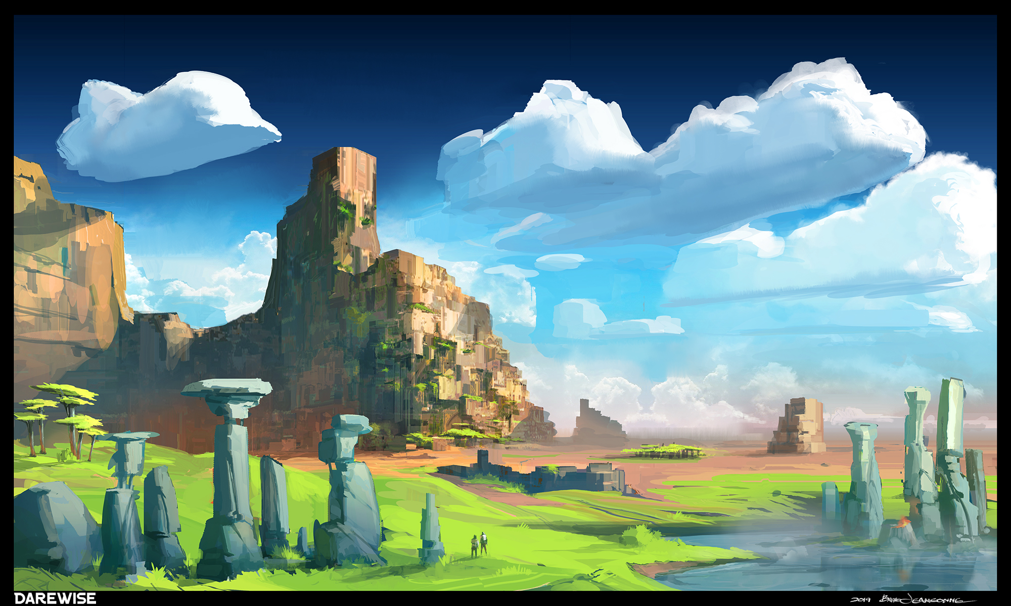
The best way to dress up a scene is to have a solid idea of what you are trying to convey to the viewer. Set dressing comes down to the setting, mood and story you want to tell. At Darewise our concept art pieces answer all of these questions, enough so for someone like me or another 3D Environment Artist to work with. Below is a concept by our Lead Artist, Bradley Jeansonne. I always request a piece like this for any new environment we work on as it gives me a global vision of what we are trying to achieve in terms of colour, palette, tone, emotion and setting. I can work with this. For example, the massive structure could be a temple of sorts, or an ancient structure that is now providing shelter for the locals, there may be caves, canyons, rivers that created the swamp, valleys, lakes, small towns and other elements not present in the image. I have enough creative freedom and trust from my lead that I can start experimenting and suggest new ideas that could fit in the world instead of requesting 20 different concepts.
Hand Placing
Hand placing always starts with composition, you should have a focal point and build the scene around that, always guiding the viewer's attention. At Darewise I was initially set dressing by hand because I had to and honestly, sometimes this is the best approach because you are able to craft everything to suit your needs. The downside is that it takes time but for any project there will always be handcrafted areas so it’s beneficial to know how to create well established shots using the tools available to you. When it comes to dressing a scene my advice would be to work in Detail Lighting mode (black and white) to ensure your values are correct. If your values are wrong then no matter what you do with your colours, the piece will fall apart. There’s a reason the Old Masters such as Raphael, Da Vinci and Rubens studied values and composition all their lives. Focus on the large shapes first and really make sure that everything you place has a purpose. Question it. If there is a rock in the sand, where did it come from? Did it fall from the upper canyons or did a ship crash, causing a debris avalanche? If so, where is the ship? These are some of the questions you ask when dressing a scene by hand.
Unreleased Demo Project – 3D Environments:


Tools & Procedural Generation
There are a variety of tools available out of the box with Unreal Engine 4 that are extremely powerful.
UE4 Foliage
Although it’s called Foliage, this tool is essentially a brush that lets you paint instanced assets in the world. This is great for both speed and optimization. You have control over lots of options such as density, random scale, cull distance, rotation and more. I’ve created a short video to demonstrate how you can quickly populate a scene with grass and rocks.
UE4 Landscape Grass Type
The Landscape Grass Type tool, or LGT for short is another tool that I use extensively at Darewise. It’s a workflow that is driven specifically through your terrain material. Each LGT can be linked to a landscape layer allowing you to procedurally populate a variety of assets on each layer. The LGT will always spawn to the layer it is linked to, so if you have a ‘Ground_Dirt’ layer and the LGT includes multiple assets such as Grass, Rocks and Sunflowers, then anywhere on your terrain where the ‘Ground Dirt’ is present will then be populated with these assets in a ratio that you determine. Take a look at this video if you want to learn more.
Procedural Generation with Houdini
With Project-C being such a massive persistent open world, set dressing by hand is considered almost impossible and we rely on procedural tools to get us 80% of the way there. Earlier I demonstrated how you can use a few nodes to create a simple scattering tool. I’ve created a video demonstrating one of the early HDA (Houdini Digital Asset) tools created during our R&D.
Lighting
When it comes to lighting, you can make an average model look incredible under the right lighting conditions, and vice versa, you can make an incredible piece look mediocre if you don’t spend enough time lighting it correctly. A lot of artists, primarily juniors tend to make their work look very flat. They will spend almost no time at all on lighting, where as I spend a large chunk of my time on lighting, it’s my favourite part of any project and to put it in context, I spent around 2 weeks lighting my Strangler Fig material between work and even when I call a piece done, I sleep on it.
The principles of art and design are a great foundation and the old masters knew what they were doing. I enjoy oil painting myself and analyze the works of the old masters to study and apply their use of light and values into my own work. For lighting it’s best to focus on emphasis, contrast and balance. My approach when lighting a piece always follow the same rules and principals, regardless if it’s a single material or an entire environment, I want to put emphasis on a specific area of the screen and draw the viewer's attention to that area. This can be achieved by making a specific area of the shot more dominant in a variety of ways such as using complementary colours, a strong contrast in shadows, increased value range, emphasis on a specific colour and rim lighting.
So how do I actually approach lighting in the 3D world?
Lighting in Marmoset

Substance Designer - Alien Webbing
The first thing I do with any Marmoset project is to enable the advanced options in the Render window such as Local Reflections, Cascade Shadows, Ambient Occlusion and Global Illumination. The latter hits performance hard but enabling this after you place your lights makes no sense, you want to work on your lighting with this enabled for best results.
The next step is to find a skybox that gives me adequate results for what I want, I then create 3 lights; my Key, Fill and Rim lights. You can do this by simply clicking on the panorama. I go extreme with the intensity as it is far easier to see where the lights are, it’s not useful to keep things subtle at this point. As my Art Director Viktor tells me, it’s always better to go extreme and then pull back. A quick video to simply demonstrate my lighting setup. Lighting Setup
One tip I have is to view your lights individually, if they work well on their own then chances are they will combine together, it’s just a matter of saturation and value.

Substance Designer - Alien Webbing Scene
Applying the design rules I mentioned earlier, my goal for this scene was to guide the viewer's eye along the main strands and towards the yellow light. The yellow light contrasts with the blue and is a complementary colour, it’s the one part of the shot that has more emphasis on the light and feels ‘alive’ These are simple point lights positioned for the scene. I use the same technique of creating 3 lights, pushing their values to the extreme and seeing how they affect the scene.
Lighting Environments
Lighting environments follow the same rules but isn’t as simple as just creating 3 lights and turning them on and off. With every environment there are endless possibilities of where a player may look or explore so as an Environment Artist I need to give them landmarks and that is where building from composition starts. You need to establish your main shot and several secondary shots to build your environment from. Unreal Engine 4 is very powerful when it comes to lighting and there are a lot of options to tweak which may scare inexperienced users but it really isn’t that difficult once you get used to it. All of these shots are created in-engine.

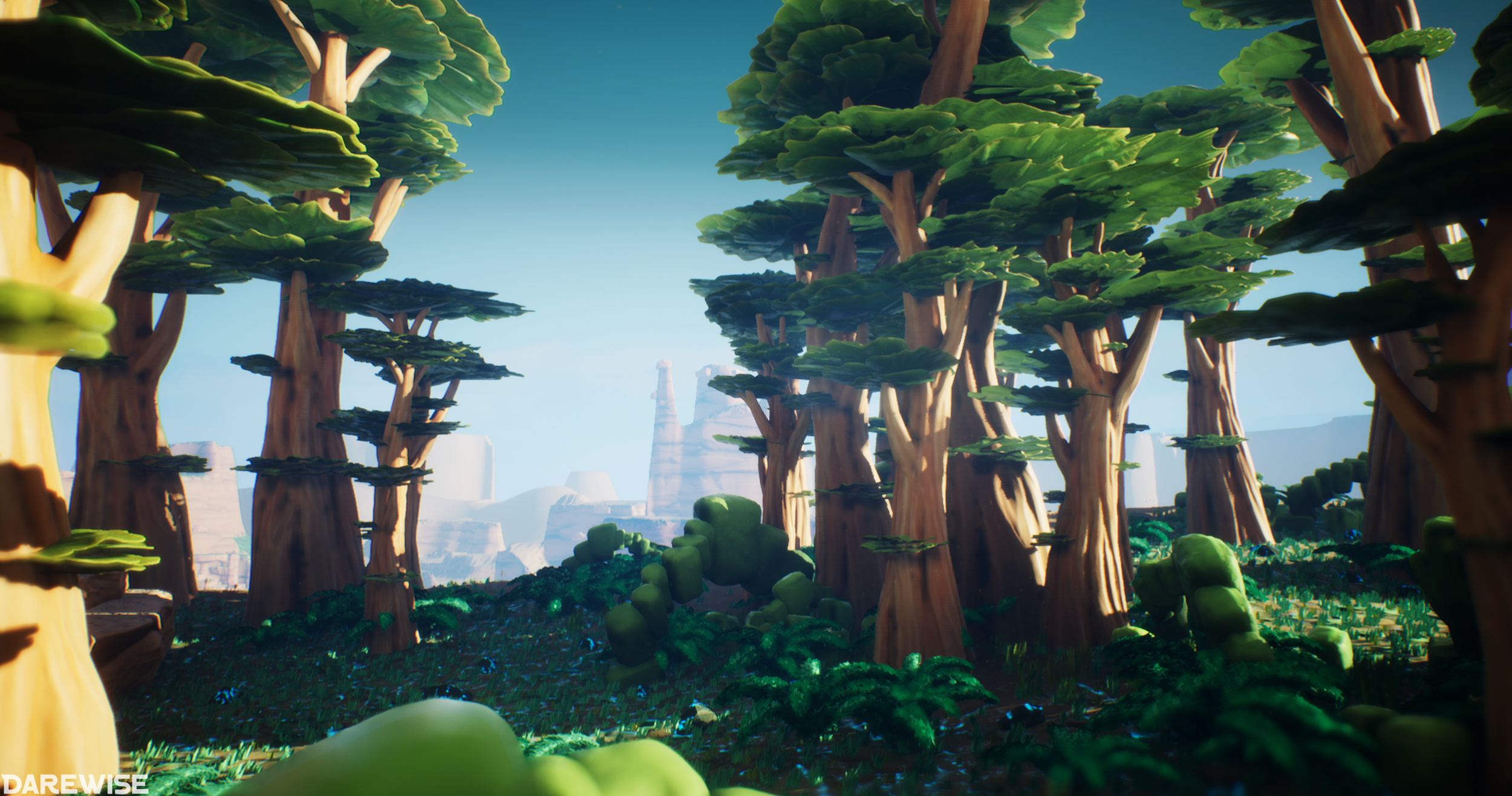
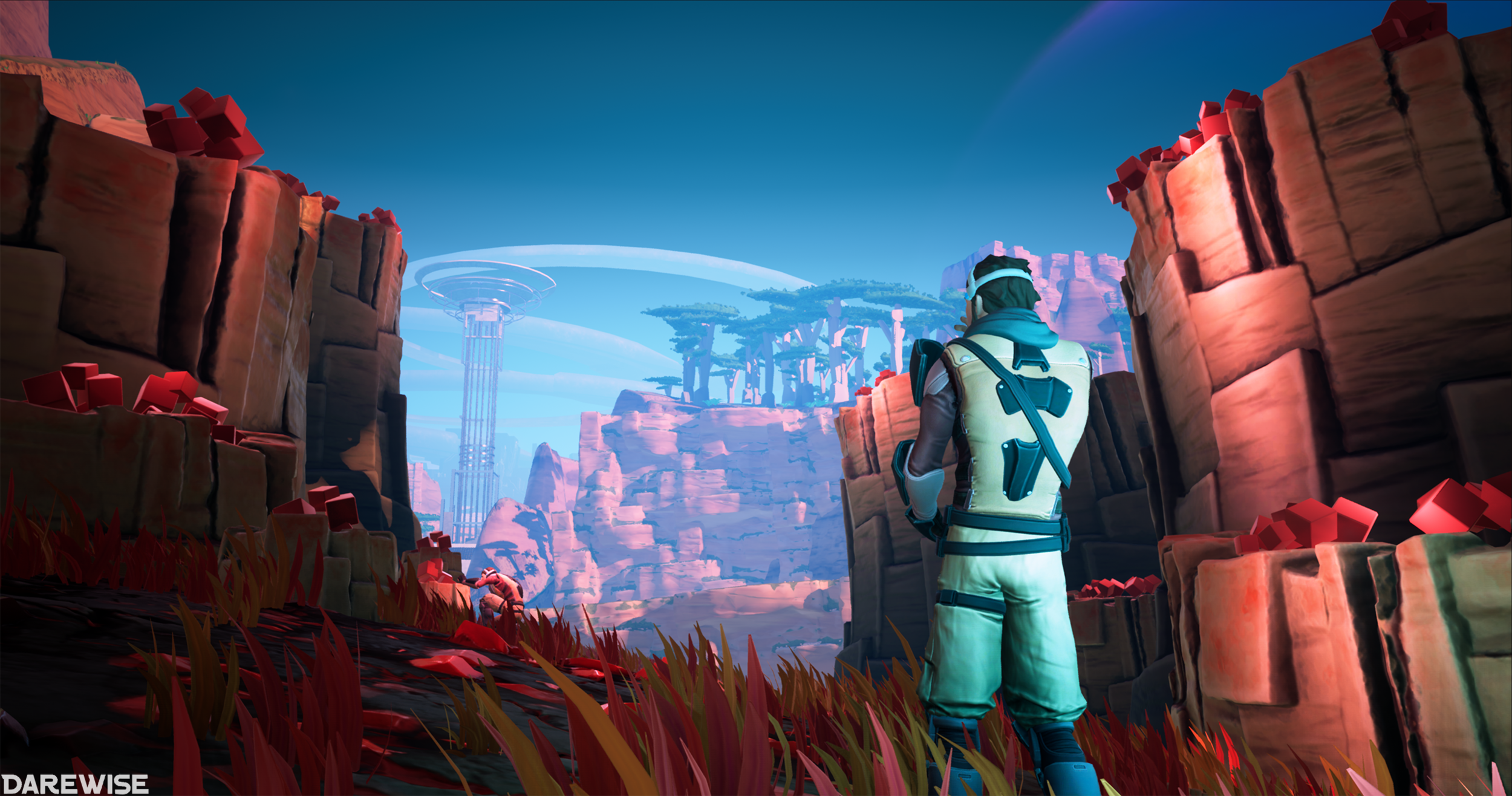
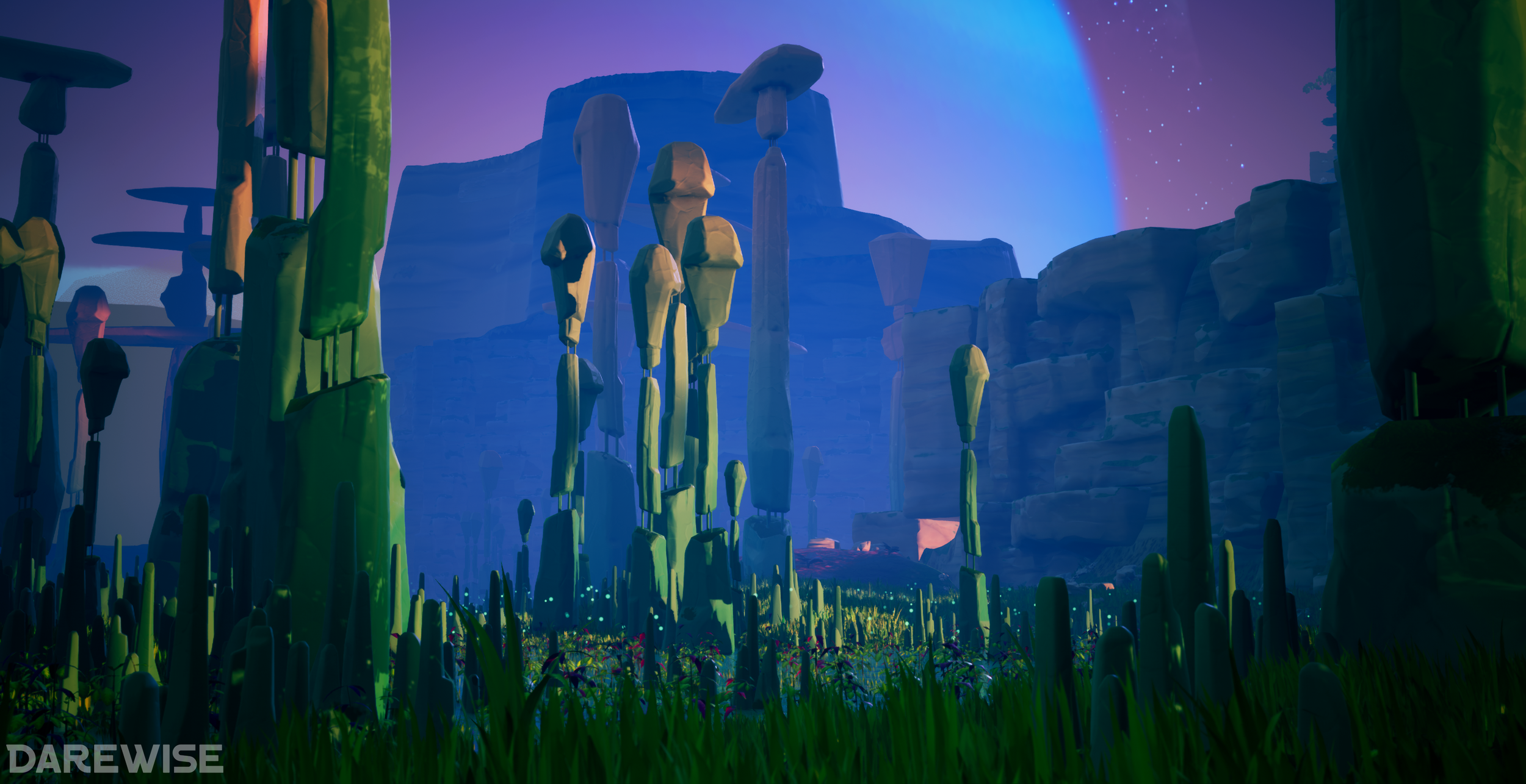
Project-C
With every shot you want it to feel alive and have a sense of depth. By combining the Directional Light, Skylight, Exponential Height Fog and Post Process Volume (PP for short), you have a lot of options. I always clamp the exposure in the PP to 1. Then you can use my Marmoset trick and start playing with the Directional Light and Skylight individually, turning them off to see how each one affects the world. With the lights, it’s all about drawing attention and capturing strong contrast in your scene. Shadows and highlights greatly help with this and is what we push for when lighting our environments. The first shot for example, the character is looking in the direction of the moon, the strong highlight is along that path and guides your eye to the resource and then large structure.

Project-C
Exponential Height Fog is a must have (or you can build your own custom fog to use in the PP. Check it out below:
Don’t go too strong with this because it can ruin an environment. The goal with this the fog is to emphasize the depth and vastness of your world.
Post Process is in the name. It’s post. Too many artists start playing with this too early on in their project and blindside themselves. You can’t accurately adjust your scene if you’re already wearing tinted glasses. I highly advise you only adjust the exposure and leave the other adjustments such as Colour Grading, Lens and Image Effects alone until the later stages of your project. You can still tweak them gradually, but the large chunk of post should be left towards the end. Below is a comparison shot, with and without post processing.

Project-C - Without LUT
Project-C - With LUT
One other cool thing you can do with PP volumes is actually take your screenshot and do the adjustments in Photoshop. Color Balance, Curves, Brightness etc. You can export those layers as a LUT and apply it directly in-engine. Your screen will now look exactly the same as your adjusted screenshot in Photoshop. I’ll leave the link to LUTs here because it’s already explained by Epic.
Lighting Tips
Lighting was something that I always sucked at and for the same reasons that many other artists experience. My work was too flat and I never spent enough time on presenting my work. Here are some tips on how to improve your lighting:
Push values to the extreme, it’s better to go too far and pull back.
Your main light source should compliment your focal point
Isolate your lights, do they hold up on their own?
Use saturation sparingly, it can be great for drawing attention
Strong contrasts in shadows/colours
Learn colour theory
Work in ‘Moveable’ mode for speed
Always step away from your screen, view it from far
When you’re done, take a break and come back tomorrow before you’re finished
Challenges
There will always be challenges when it comes to building environments. One of the biggest challenges for me is composition because it’s one of the fundamental skills of art that is simply not taught anywhere and is something you learn through experience. Another challenge, mainly in production, is maintaining a coherent style, especially one you are building. When working with other artists you all have to be on the same page.
When working stylized you run the risk of making your art too simplistic. If that’s your goal, then great, but with Distilled Reality it’s a balancing game. Squint your eyes right now and look around, you’re removing all the details but retaining the shape and form of the objects around you. This is how you preserve artistic value in your work without losing realism.
Conclusion
If anyone has any questions you can find me on the NMG Discord or feel free to message me on Artstation!