
HAND PAINTING STYLIZED ENVIRONMENTS
Jacob Claussen did a beautiful hand painted scene for the King Arthur challenge and talks to us about his process of achieving such a style. Learn how he planned for the project, crafted the assets and built this environment
Introduction
My name is Jacob Claussen and I work as a 3D artist at Ubisoft in Stockholm. I started my career with an Indie studio that me and some friends built up, we released the arena brawler game Blast Out. After being Indie I wanted to see the other side and how bigger companies work and learn from it so i joined Starbreeze Studios and worked on Overkill's The Walking Dead as an Environment Artist. With the game released I wanted to test out a different studio and I found myself joining the newly opened studio, Ubisoft Stockholm as a 3D artist.
While studying at The University of Skövde I was not really sure what path to take in 3D but I joined the school with the aim to work with animated movies in the future, I joined a game focus university and after some time I knew I wanted to make 3d art for games. Over a weekend I played the game The Last of Us and then it was also clear to me that I wanted to go in to Environment Art and I focus on that full. Then two years ago I started a new shift where I want to focus on 2D art and see where that brings me. My first goal is to help illustrating a kids book that my friend Sara Forsberg is writing.

King Arthur Challenge & Working From Concept
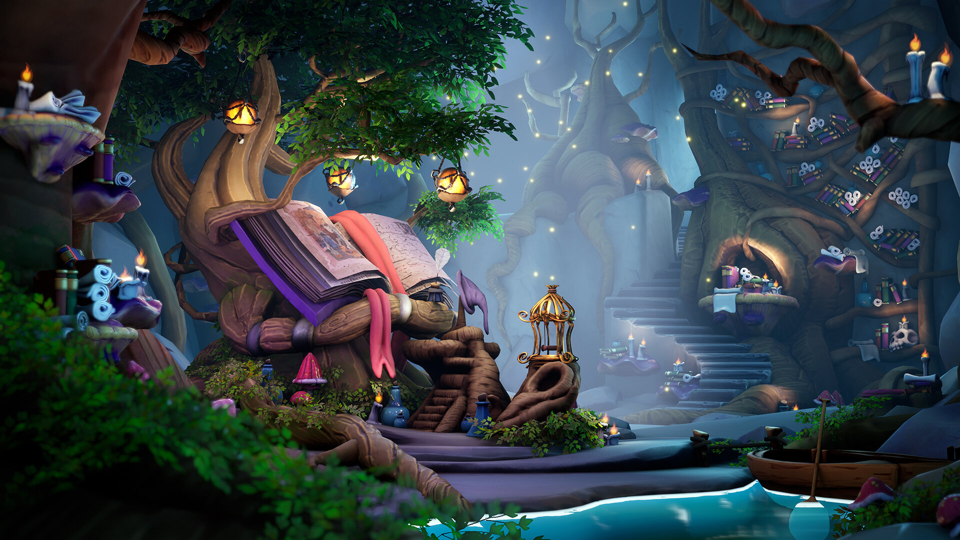
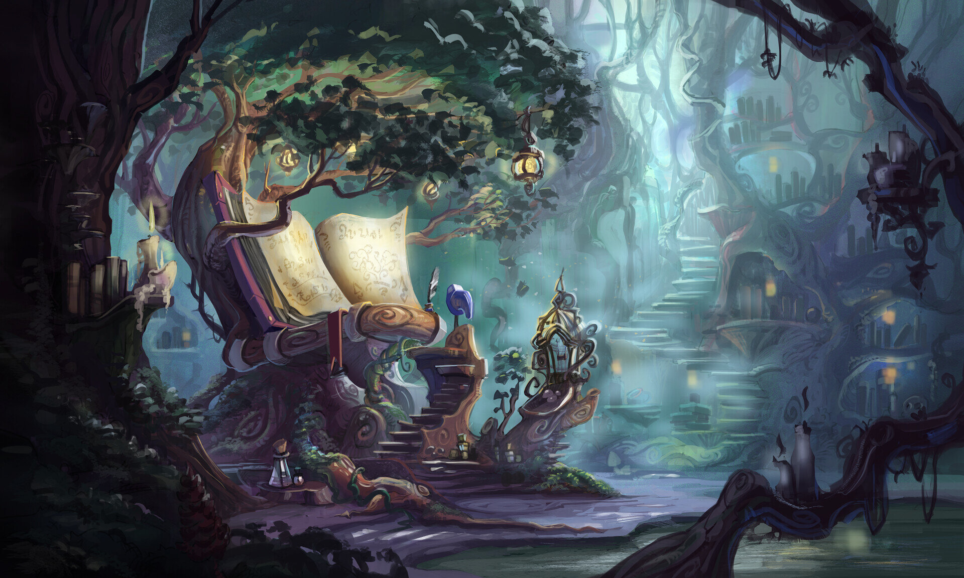
So I wanted to capture the beautiful concept of Emilie V.F and then take it where my vision was of it. From the beginning, I knew that I wanted to give the piece a strong stylized feel to try out something i´ve not done in a while. So after finding reference of styles where I wanted to take the piece to it was very easy to keep a consistent style. I really liked Emilies silhouette and the compositions so I wanted to keep it like that for my main shot, so I started with a blockout on top of it. This got me to keep the quirky silhouette but maybe push the colour bit more. I kept a big focus on taking the main picture to an okay quality so after that I could focus on working on the room around it and give that my own ideas.


When you get a concept it’s important to try to give it your own ideas, it's good training for when in the real work situation can happen that you just get some call outs with google picture or are on your own completely. Try to see that as something fun and rewarding. Also if you know the artist of the concept it's always fun to keep in contact and try discussion where the 3D version can be taken, learning to find a middle ground with other creators is very good for when you later come to the industry.
Planning and Preperation
For me usually a scene is my time to learn new skills or revisit old skills and refresh my memory. I wanted to really try stylised after not using it for a couple of years. Also my biggest focus on this project was time management, something I always try to keep improving both for project at home but also at work. Being able to plan on a daily basis at work is a good thing giving you time to add or improve stuff without missing out on the deadlines. It will really show if you know how to structure your workflow and it's always a welcomed thing by leads and producers.

Progress
My first action when starting a scene with a concept as a base is to do a blockout version on top of it with all the assets in Maya. This made me get the depth, composition and amount of props that would be in the scene. This gives you an easy way of structuring your uvs and asset creation in your planning. I also did some quick bakes in Maya’s renderer Arnold, it was very good to get a clear read on the forms of the assets and the room. After this I take everything in to Unreal Engine 4 and cut it up so everything is placed in the scene as a proxy model with materials and textures. This makes me able to just update the fbx and the materials of scene in a quicker way while working on them.

Assets

Assets
After that I put in a base lighting pass and try to see if the scene get the same feeling that the concept or idea you have of it. After that is just starting to create the assets and always pay attention to the bigger picture, not watching the texturing only take place in Marmoset or Painter. Look how it always look in the engine you work in.
Being early with your vegetation can save a ton of time also, trying to be smart with it and do a quick version of it is always good. I always do a painted Photoshop version and map the tree canopy quickly to it. Then in a later stage I will do a high poly with all the nice texture to boost the read of the canopy even more. Tom Deerberg is a great artist to look at when doing this, he has tons of research scenes using this method.

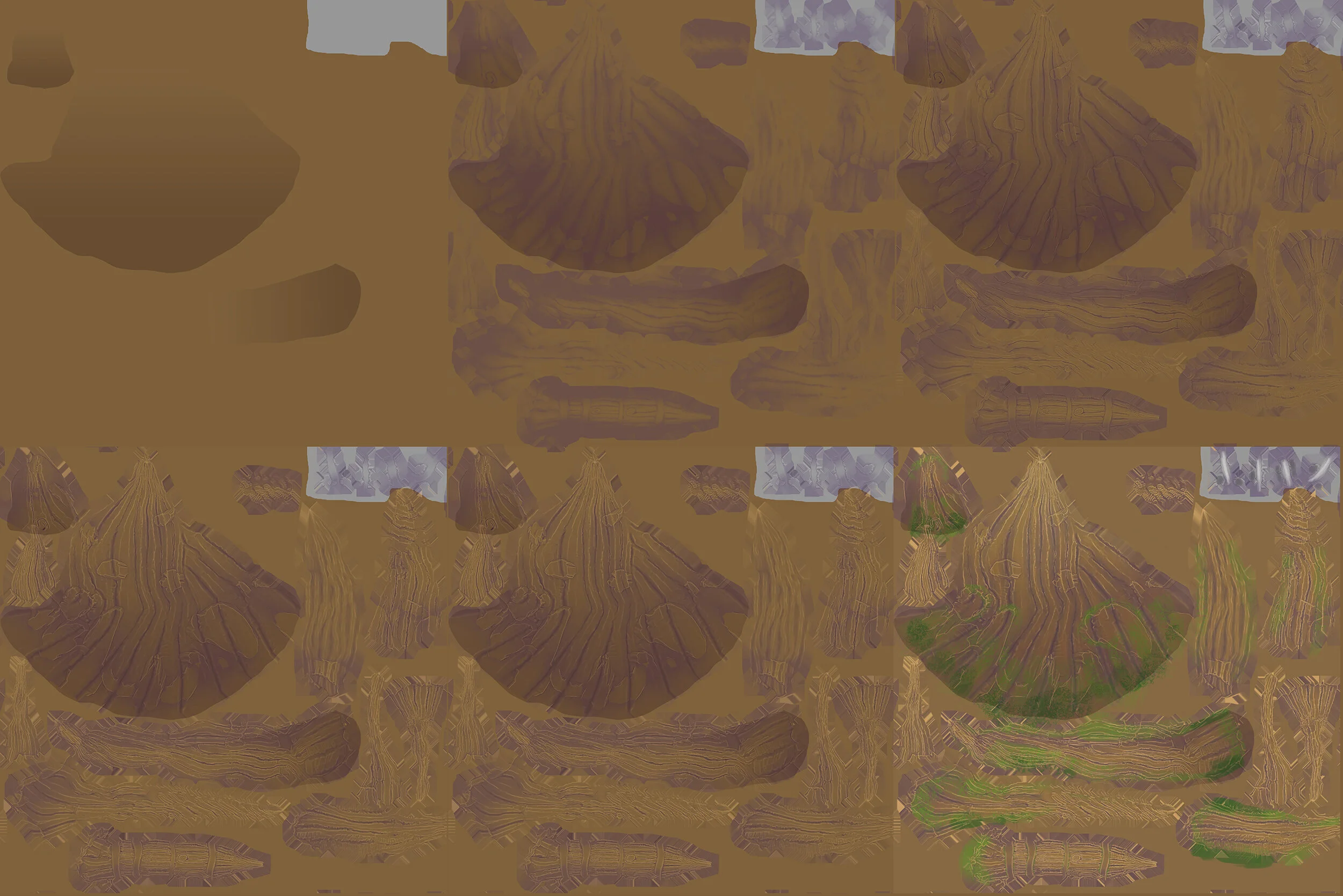
Texture Sheet with Geometry Outline
The assets were modeled in Maya, then adding the detail in Zbrush that gives the baked maps a good base for later painting the finished texture in Photoshop.
Creating Stylized Environments
I was lucky picking up this style during my time having an Indie company with some friends. We created a game called Blast Out a type of MOBA game that had to have a lot of content. So for a small studio to make that work with only two 3D-artist you need a smart workflow.
Some props were newer to me than others. For example, trees in this style was a new experience and I was trying to find a good quick way to create the trees knowing that the scene had a great amount of them. Starting out with the main tree gave me a good workflow to apply on the other trees and then I did not need the same detail being not in the center of the scene.

Tree Breakdown
Using Zbrush as a base to get the most information from the bakes that you can is key. This is something they have been doing at Blizzard for some time, what you basically do is create a detailed highpoly with enough surface definition that it will show in your baked maps. Then you use these baked maps as masks in Photoshop to get a really strong base for your lowpoly.
Texturing Process
Trying to add assets that you don't have any concepts on I think is a good thing to train being able to pick just a random item from a google image, like mushrooms or some candle lights and push it to the style you are working on. Remember to always have a reference board for both real life and styles you are aiming for, when starting out its very good to mimic how other did things that work. Just remember that asking why and learning from it is the important factor, why did this style in this game works and how can I apply it to my stuff. After doing it for a while you will find your own voice.
A good rule for doing variation of props is not overdoing the amount of them, a good rule to follow is maximum of three when it comes to the shape. Then if you want, you can have different color variations of them. It may seem little for trees but remember that when you put them together with different shapes you create new shapes, so two candles next to each other and a bottle will read like a new silhouette and give the scene some interest.

Asset Variation

Composition & Colours
For this piece I tried to play with coluor and using it more as a tool, looking back on it I feel like I could push this even more but it was a start and I think it's something that can be superfun. Writing this I see that i had picked up new things that were not implemented fully to this piece but I want to give a more general outlook on what composition and colour can be.

Composition is basically a tool to give the viewer a path to the subject of your image and the construction of that can be used in many different ways. Usually we hear about rule of thirds and fibonacci spiral as tools for this but there are so many other ways to do this. For leading the eyes you can use different paths, some examples are S-Shape, Diagonals, Grouping, Radiating Lines and so on. The more tools you have, the more you can play and combine them to achieve an even more feeling of “wow-ness” in your images.
It usually starts with creating a focal point, what the viewer is supposed to see or pay attention to. You don't have to just have one and sometimes you want to have the viewer stay longer in the image. To create a focal point you usually play with contrast, make it stand out from what ́s next to it. This can be achieved in different ways, such as having a different shape, value, alignment, lightning and so on. Study how others do this and you will start to see there are many ways to create a focal point.
3D games has not been around for that long so I think when going and studying this subject we should look at mediums that have been around for longer and perfected this method. Cinematography in movies has an extremely deep understanding of that skill and I think learning from them can make your environment stand out even more. We also have painters that have been around for much longer and created a long list of tools to use. In the future 3D games are going to evolve even more because this medium has a camera that is usually handled by the viewer with makes it even harder to make this work.
Already having a strong composition from the wonderful concept made by Emilie V.F. I wanted to push my understanding of colour and what I could do with it. So colour became my main feature of composition and playing with warm and cool colours, I added some contrast in these shapes of warm and cool colours with the counterparts to have some balance in the image and give the eye to notice while wondering over the image.
To balance the colors you can use different colour combinations and the most common one is complementary colors, if you look at the color wheel use the color on the other side from what you picked. So for example blue and orange goes well together but be careful, some tropes are played out more than otherS. To add an additional layer on top we can look in to what feeling colour can evoke and let them set the mood of the image. Colours have both positive and negative communications in them, study these and applying them in your composition can really make your image tell a deeper story. But remember this can be very dependent on what culture you are living in because colours evokes different meanings depending on where in the world you are.

Colour Theory
Usually to give depth in an image you have the foreground, midground and background. To give the viewer a feeling of atmosphere it can be a good thing to have different tones where the foreground is darker and it becomes lighter in the background. This gives your 2d image a feeling of 3d in space.

Foreground/Midground/Background

Guiding the Viewer
Try to lead the viewer through the image and the path you set a story, this can be with the help of symbolism or just set dressing in a way that tells what happened or is going to happen, ask yourself what happens in the room. Maybe place yourself in it and walk through it, play out the scene and what could happen. This gives the scene more life and more interest for the viewer and it can give the image “rewatchability”. Your viewer finds new things everytime they go back to your image.
I tend to read tons of books by artists in other fields and I think it’s key if you want to really push your sense of composition, here is a list of books that are really good reads to start with. After reading these you can start doing studies from paintings, movies or photography. I ́m still doing baby steps in this field and I´m looking forward to the coming years when I can take this a lot further.
My book tips to start out with.
The Filmmaker's Eye
Color and Light: A Guide for the Realist Painter
Edgar Payne’s composition of outdoor painting
Framed Ink
The Art of Pixar
Lighting & Texturing
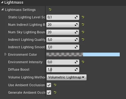
I see lightning as one of the key things to hold a scene together and usually it's what makes a scene stand out from others. I use baked lightning but with a GPU plugin to make that progress faster, I still prefer using instead of real time because of the bounds but would like to experiment with real time in the future and see where I can take my lightning with it.
World Settings
With this scene I wanted a magical colorful feeling and try to use colors that compliment the scenes colors, so a mixture of blue and lilac to compliment the scenes warmer colors in red and browns. Then it was just to experiment with direction and using the lighting as a story element.
Advice & Tips for Stylized Pieces
When I work on stylized I usually focus on the silhouette first and try to give it a bigger character than it would be in real life. Then it's easier to add secondary detail and information on the surface, where it’s usually better to scale back from the real life counterpart. Try to not get to noisy.
While giving the asset some extra silhouette use a white background and make the object black, this way you can see if it reads well. In Maya there is a great tool called Lattice tool where you can create a box around your object and push the proportions, I tend to model the object in a more natural silhouette first and then bend it around and giving it some more character.

Lattice Tool in Maya
I also think analysing other pieces is important, look at how they get there props to read well. Try finding versions of the props being just with the base color and see how much that is pushing the prop. Sketchfab is a great place to turn around objects and see the different texture maps. Sometimes it’s amazing how few polys and texture maps an asset is using but still reads so well.
Essential Skills to Possess
Nowadays all the skills you need to create really good art is online and you can tell that the students have a much stronger understanding of that.
Planning and folder structure I think is a thing that artists usually start really using after a couple of projects and not being able to find where they put that texture. If you structure your time for the piece it's going to take away a ton of stress also. Being more relaxed about problem solving stuff is going to give you better results, so try to work smart.

Planning
With good planning you can give yourself the freetime and rest that we usually skip during a project, so I tend you always plan in social and “not-being-at-the-computer” activity weekly during my projects.
Another skill I think that you need to be able to use is seeking feedback and knowing what to do with it, people can come with ideas and suggestions that maybe are in one sense right but not for the piece you are doing. So being good at giving yourself feedback and understanding feedback is going to make that much easier to filter. Try to analyse your own piece as much as possible, play an art director and be honest.
Challenges
For me it was probably that it was during the time of summer where usually we in Sweden are going on holiday so finding the time was the tricky part. But I'm quite happy with the planning I did beforehand where I planned on having some free time. With more time I would have loved to work on the presentation more which is something I ́m going to bring to my next project instead.
I also learned a ton of following the other artist making more of the stylised creations, so I will bring what i learned from their posts in to future projects. This is the biggest reason for me being in these challenges, you are both learning from doing a scene with a strict deadline but you also see how other artists are tackling the problems you are encountering.
Thanks for being able to do this interview. If there are questions about anything, feel free always to DM me or send me a mail.
