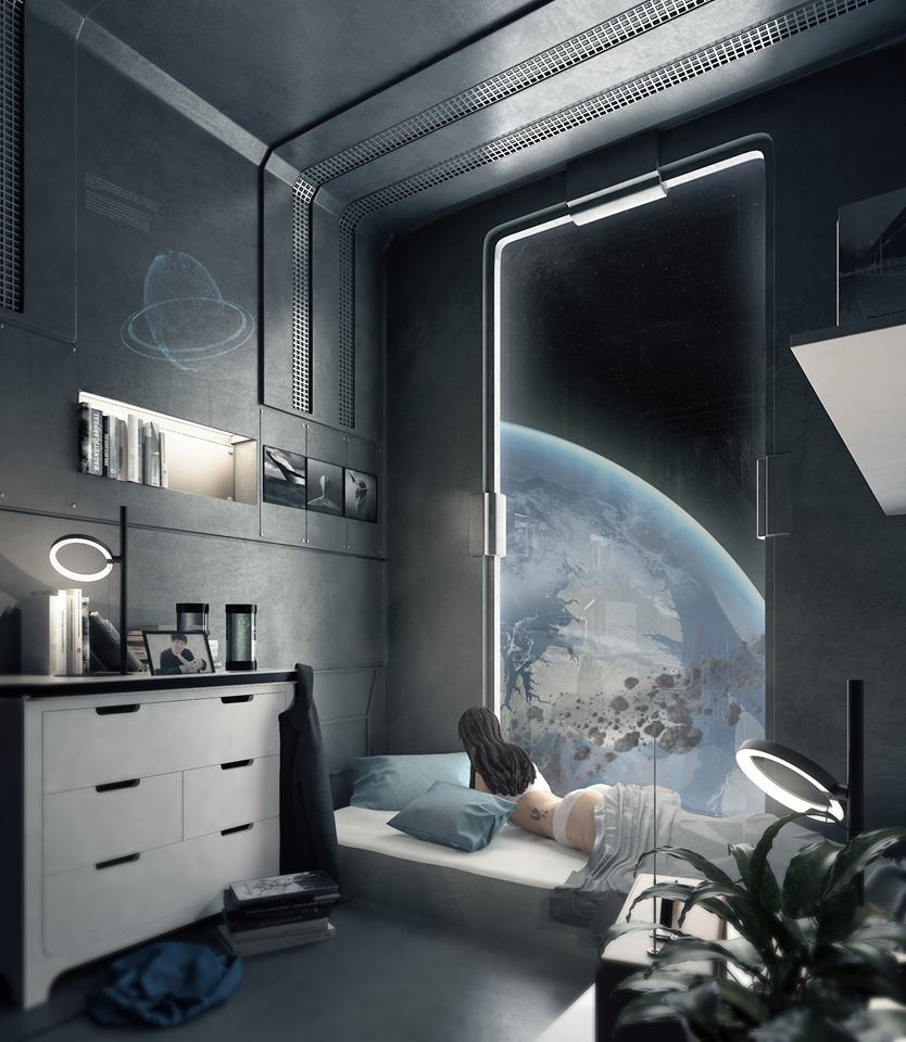
new earth - creating a unique living space. IN SPACE.
Gabriel Enriquez talked about the way he approaches new projects, working from concept, the tools he used to create his New Earth scene and more.
Introduction
Hello! My name is Gabriel Enriquez. Currently, I’m the Chief Technical Artist and co-founder of Veer Immersive Technologies, a VR startup based in Manila, Philippines. We primarily create virtual reality simulations for professional training.
My journey into 3D game art is a rather peculiar one. When I was a kid, I played a ton of Nintendo and PlayStation games. I was fascinated with how these virtual worlds capture your imagination and feel really immersive. I told myself that one day I would start creating my own imaginary worlds.
I studied Civil Engineering at the University of the Philippines Diliman. During my college days, virtual reality was starting to attract mainstream attention especially after Facebook acquired Oculus back in 2014. I foresaw that this was going to become a huge industry someday especially for enterprise applications. That was the time I hopped into the VR hype train and knew that I wasn’t going to become an engineer. Rather, I would become a VR developer.
It was during my self-study on VR app creation that I was introduced to 3D modeling. I joined a local Google Cardboard VR app competition with a friend back in 2015. I had zero knowledge of 3D modeling and game engines, so I pushed myself to learn Blender and Unity in a span of a month. It was an amazing learning experience. As 2016 flew by, I realized that I really enjoyed 3D modeling and began extensively studying other DCC apps such as 3ds Max, Maya, Modo, Substance, etc. Eventually, I started a VR company with a group of friends, and I was given the role of leading our 3D team. That leads us to today.
Capturing the Feeling of a Living Space
Credits to Tom Schreurs! He created the original concept art of New Earth. He graciously gave me the permission to use his art as reference. I was really captivated by the way he portrayed the duality of ideas in the scene, feeling both relaxing and gloomy. We often think of space habitats as these flying utopias in outer space. In contrast, Tom's use of minimalist objects, desaturated colors, and clever storytelling depicts a feeling of melancholy underneath our initial impressions of his work.
When starting out with personal projects. I recommend knowing your strengths and weaknesses. In my case, my modeling and lighting skills are decent, but my texturing and concepting are lagging. To compensate, I usually do projects that already have an established concept art.
Creating the Scene
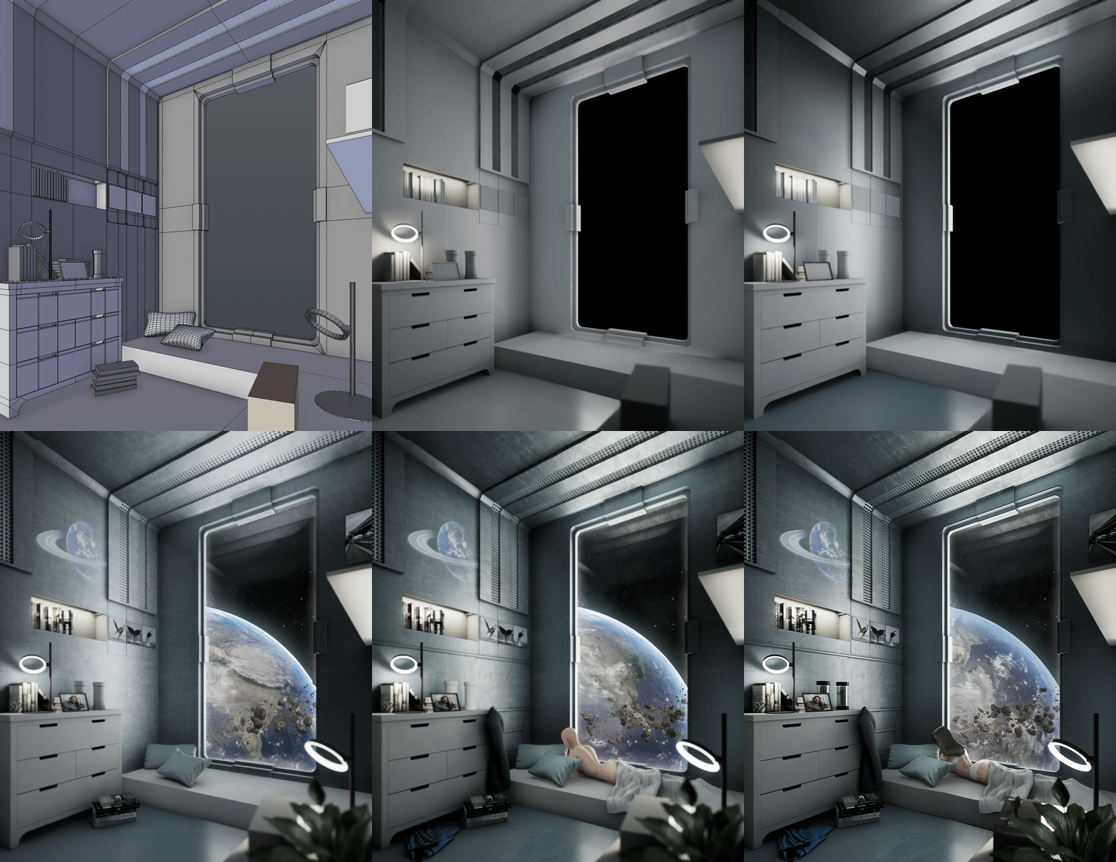
I covered this in detail in my ArtStation blog. I used Blender in creating most of the assets as well as assembling the scene. A little bit of Substance Painter for texturing. Afterwards, I exported the models individually into Unreal Engine for rendering. I pretty much did the standard workflow: blocking the scene, initial lighting pass, texturing, detailing, 2nd lighting pass, post-processing. I normally create the easy assets first and the harder ones last. It's very important to iterate on every step of the way.
If there's one tip I could give you, it is to focus on the lighting and post-processing. One of my mentors told me that a very good lighting setup can compensate for the other shortcomings of a scene such as flat/mediocre textures. In most of my projects, I spend 2-3 times more on lighting than on modeling and texturing.
Composition and Lighting
Once again, credits to Tom for the concept. He did an amazing job with the composition. The camera in the scene has a vertical shift applied to it, a technique often used in architecture to capture tall subjects while maintaining straight vertical lines. Adding this to the window showing the Earth, I think these elements contribute to the feeling of vastness you mentioned.
I covered in detail how I did the lighting, the planet, and the asteroid belt in my ArtStation blog.
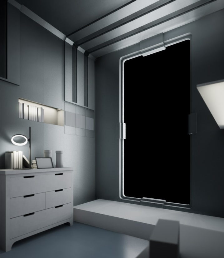
For the lighting, the primary light source is a Static Rect Light just outside the window. I turned off SSAO and Auto-Exposure, and turned on baked AO. I did a lot of tweaking with the placement of the lights and the reflection capture to get the desired look as well as adjusting the intensity of the Screen Space Reflection. I also used a 25% Desaturation on the post-process volume since the original reference seems to be pretty desaturated. Later during the creation of the scene, I adjusted Indirect Lighting Quality to 2.0 and Indirect Lighting Smoothness to 0.6.
The asteroid belt seen through the window is made from rock mesh particles spawned along a cylinder. I placed them in a separate lighting channel to make it easier to control the way they're lit. It's definitely more optimized if I used flat planes instead of meshes, but doing that would somewhat make it harder to tweak the way they look.
Hair Creation
Real-time hair is no easy feat! Huge respect to character artists who have the patience to do high quality hair. The process is covered in a bunch of 80 Level articles: here, here, here, and here. I tried making my own and ended up with ghastly results. In the end, I studied the hair assets from Epic's Paragon and found Shinbi's hair to be the closest fit for the character in the scene, with a couple of adjustments.
Environmental Story Telling
There are a lot of important skills. If you ask multiple environment artists, I think each one will have a different answer. In my opinion, the most important one is the ability to tell a story with your environment. Based on statistics, the most popular pieces I've made are New Earth (concept by Tom Schreurs) and White Tower (concept by SnowSkadi). I think the common element between these two is that they capture people's imagination, make them wonder and raise questions.
For New Earth, people have asked: What happened to Earth? Is it dying? Who is this woman? Why is there a father and child photo on the table? Was she separated from her family? Or maybe her husband urged her to live a more comfortable life in a space habitat?
For White Tower, people have asked: What is this castle? Why is it in the middle of the sea? Why does it seem like it's reaching for the sky? What kind of people live here? Can I enter the castle and climb all the way to the top?
What was the Biggest Challenge of Creating the Scene?
Definitely the female character because I have zero experience in character creation. It was a great learning experience.
Tips and Advice
Environment art is both fun and challenging. You never get bored because of the variety. It can be overwhelming at first. I recommend taking one step at a time and focus on a particular type of environment. Afterwards, move on to another type of environment. In my case, I started with sci-fi scenes which taught me things like hard-surface topology, weighted normals, metallic/roughness map creation, normal map baking, etc. After that, I did a little bit of ArchViz which taught me real-world lighting, post-processing, lightmap baking, etc. You gain a lot of information for every scene you make.
Moreover, I recommended doing a scene which you can finish within a month (less than 100hrs). For personal projects, there's always a possibility of burnout. I made that mistake twice in the past when I tried to make scenes that were beyond my skill level. After more than a month, I realized I wasn't ready and dropped the projects. Choose carefully what you want to create. Otherwise, you'll end up adding more files to your "unfinished" folder.
New Earth Asset Sheet
New Earth Colour Grading
Lastly, be active in forums and groups such as Polycount, The DiNusty Empire, and No More Grid. You get industry insights by hanging out with these people. Don't be afraid of posting your WIPs and allow other people to look at your work from different perspectives. Always seek feedback and strive to become better.


